Justwaps

Justwaps is a digital startup engaged in digital communication through the WhatsApp chat system. The company creates 100% customized chatbots for WhatsApp, disseminating information to users.

Justwaps is a digital startup engaged in digital communication through the WhatsApp chat system. The company creates 100% customized chatbots for WhatsApp, disseminating information to users.
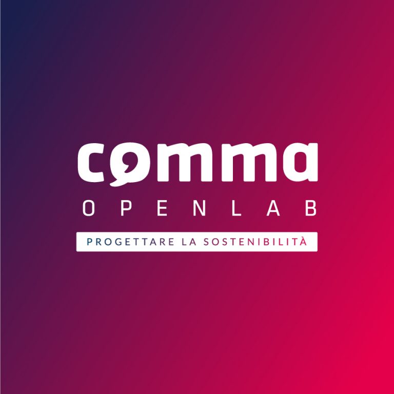
Comma OpenLab spreads the culture of sustainability and supports companies wishing to implement sustainable initiatives integrated into the business. The name derives from the terms "communication" and "marketing" merged together but also refers to the concept of the typographic "comma", paragraph in English. The logo was designed by integrating in the letter O the icon of a balloon as a symbol of communication par excellence, with a negative comma inside.
The Shakespeare School logo seeks to express, through its symbols, the most significant aspects of the study of British literature, closely linked to its most illustrious name: William Shakespeare. The phoenix is undoubtedly a well-known symbol in European literatures and also in the verses of Shakespeare; it is born, dies and rises from its ashes, representing the constancy and perseverance of the student during his studies, important aspects that allow him to build a solid career.

The HashtagWorkspace logo represents a rounded square divided in four colored areas by a white hashtag symbol. That's because HashtagWorkspace is a collective of different professional areas, a community of digital nomads and workers living in Las Palmas de Gran Canaria. The home icon inside the logo stands as the HashtagWorkspace building, based in Vegueta, the historical district of the city.
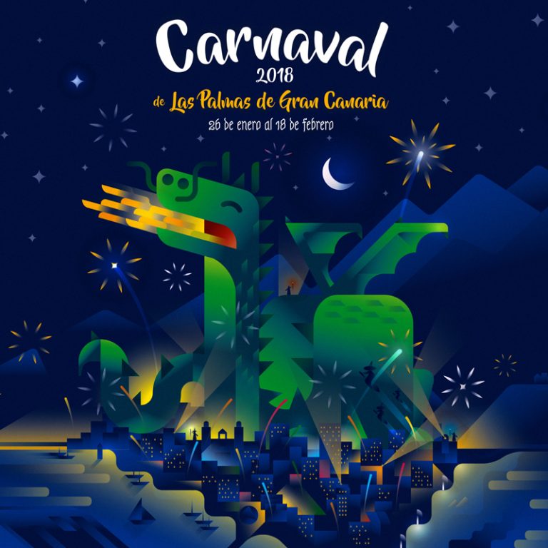
The municipality of Las Palmas de Gran Canaria launched the contest to select the official poster for the Carnival of the city, the most important event on the island, recognized at national level as one of the most beautiful carnivals in Spain. The purpose of the competition was to design a poster according to the theme of “magic and other fantastic creatures”. We are proud to announce our victory in the 2018 edition of this prestigious competition.
The competition, organized by Zooppa.it and Ca 'Foscari, involved the creation of a new interpretation of the Ca' Foscari logo together with its existing logo. This new interpretation consisted of a customized version of the logo for the University's 150th anniversary.

"L'Arno" is a blog centered on Pisa and its citizens. The name, taken from Tuscany's longest river, needed to be transformed into a visual identity that represented the journalistic publication and its strong connection to the region.
The logotype design addresses this challenge by emphasizing Italian orthography with one of its characteristic elements: the apostrophe. Essential for the name's correct spelling, this typographical element was highlighted and merged with the letter "L" to create a glyph with the right proportions and excellent legibility.
This graphic solution, focused on linguistic precision and recognizability, visually anchors the brand to the territory through institutional red, a direct reference to the official color palette of the Municipality of Pisa.

We have built a whole world around Springly, and at the same time we have designed various types of personalized merchandise, from mugs to t-shirts and dinner placemats for the Bitácora hotel.
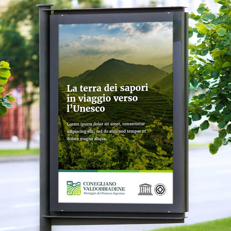
Zooppa launched a logo design competition in order to represent with strength, incisiveness and immediacy all the key values of the territory of Conegliano Valdobbiadene, in the Veneto region of Italy. The purpose was to support his candidacy for UNESCO World Heritage Site.
The Stepsurf logotype and brand are intended to communicate aquatic sports and summertime in Gran Canaria, where summer lasts all the year. The composition represents a tropical island with palm trees and the logotype incorporates the shape of this peculiar board through the letter F. Blue and Yellow are not only the colors available for the tables, but also those of Canary Islands' flag.