E_mob Festival – 2022 Edition
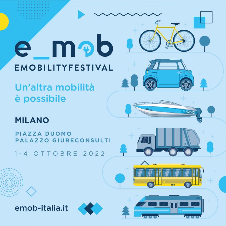
E_mob Festival has reached its sixth edition this year and we are really proud of the results obtained with our communication, thanks also to the non-stop work of Class Onlus, the main organizer of the event.

E_mob Festival has reached its sixth edition this year and we are really proud of the results obtained with our communication, thanks also to the non-stop work of Class Onlus, the main organizer of the event.
CEM unites the main leaders of the blockchain and crypto community at an Italian and international level. It's a unique event that offers the opportunity to learn all about blockchain and DeFi ecosystems, meet and share, but also network, make new partnerships and create synergies and collaborations.
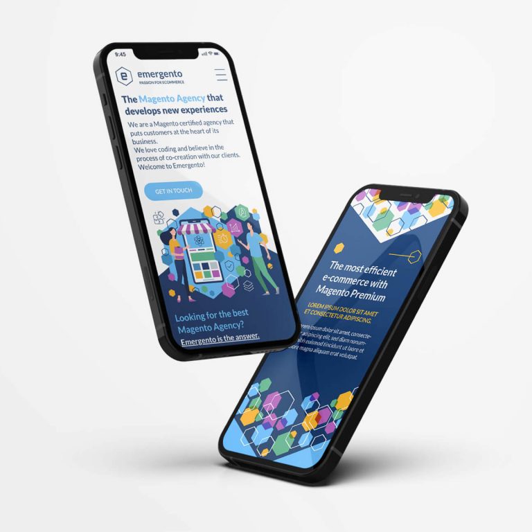
Emergento is a Magento certified agency that puts customers at the heart of its business. We helped the team create the user experience and graphical style of their new site.

Blockchain Week Rome is the largest Italian event dedicated to blockchain, cryptocurrency and NFT. We have designed all the contents of their social channels for the 2021 edition.
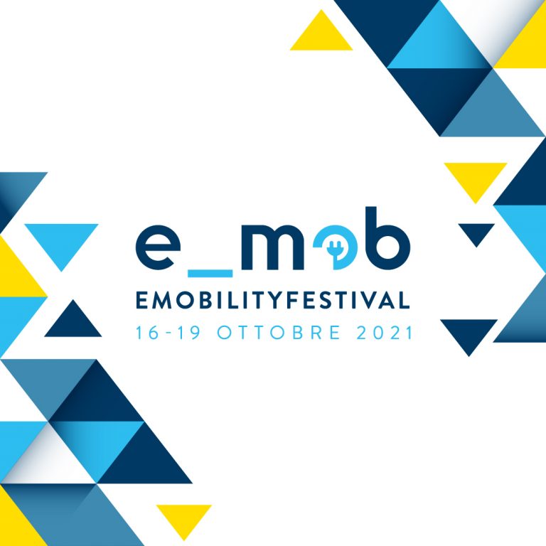
E_mob is the permanent round table and the Italian community of electric mobility stakeholders:companies, public administrations, research institutions, non-profit organizations committed to implement and report on zero emissions mobility.

iJump is the most exciting Skydive experience in Gran Canaria, an incomparable adventure jumping out of a plane over the impressive landscape that the island offers all year round. For this brand we have designed the official team shirts and various merchandise to strengthen the visual identity of the most adrenaline-fueled service in Gran Canaria.

mTalk is the MessageNet app to call any phone number in the world at extremely low cost. We redesigned the sections of the landing page, adding original illustrations to the side of each paragraph.
MessageNet is a leading company in the development and marketing of VoIP, mobile and fax services on Internet. The logo restyle focused on a minimal approach of the "M" letter of MessageNet brand.
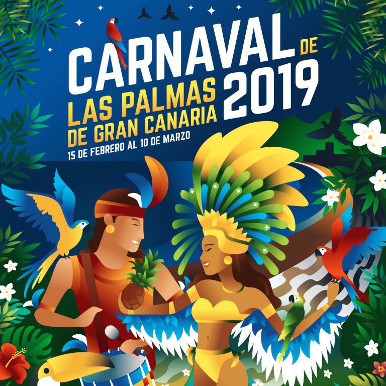
This is our proposal for the poster contest of the Carnival of Las Palmas de Gran Canaria, on the theme “A night in Rio”. We are proud of our creative result, even if this time it was not the winning proposal.
Sfrutta l'Agronoma is a project born with the intention of spreading good practices and knowledge on plants and gardening, the vegetable garden and green design, through a technical but simple language. The logo reflects the Italian saying of "green thumb", identifying the agronomist as a fantastic being with green skin, a wood elf capable of perceiving the sensitivity of the plant world.