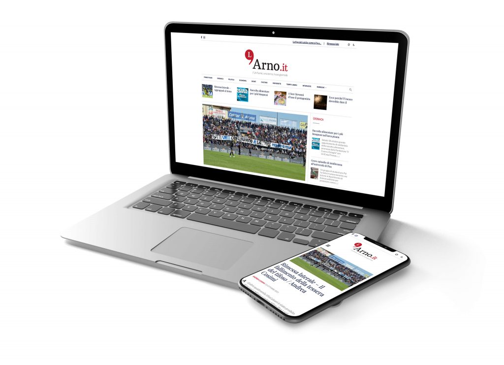
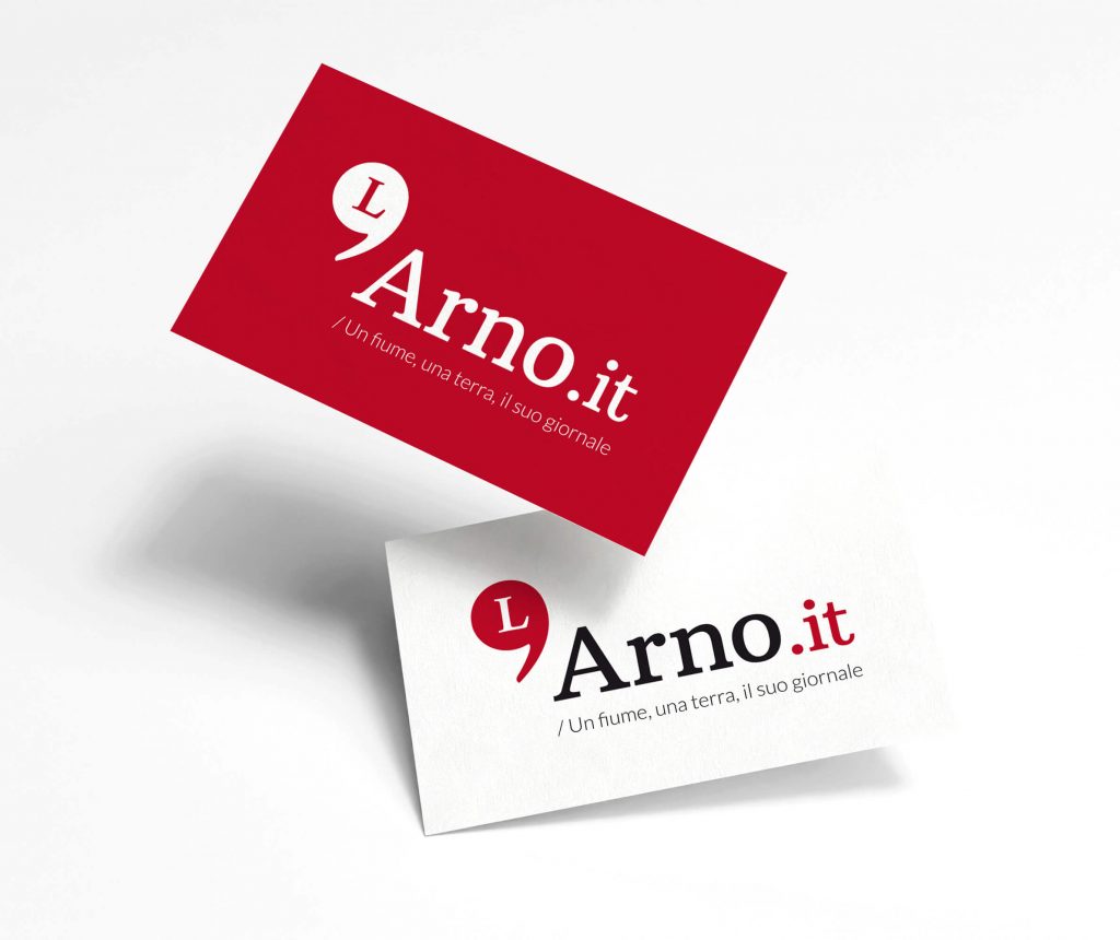

"L'Arno" is a blog centered on Pisa and its citizens. The name, taken from Tuscany's longest river, needed to be transformed into a visual identity that represented the journalistic publication and its strong connection to the region.
The logotype design addresses this challenge by emphasizing Italian orthography with one of its characteristic elements: the apostrophe. Essential for the name's correct spelling, this typographical element was highlighted and merged with the letter "L" to create a glyph with the right proportions and excellent legibility.
This graphic solution, focused on linguistic precision and recognizability, visually anchors the brand to the territory through institutional red, a direct reference to the official color palette of the Municipality of Pisa.