Isleta Design Studio

Isleta Design Studio

We are an Italian design studio, founded and based in Canary Islands since 2016.

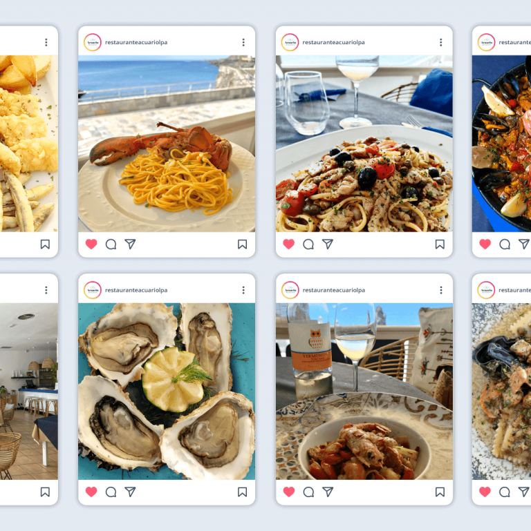
IF&B Grupo Comit – Social Networks

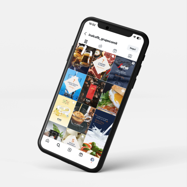
We managed the Instagram profile for IF&B Grupo Comit, a specialist in the distribution of high-quality Italian food products. Our 2025 project defined a complete communication strategy, working within an existing brand to highlight its quality and vision.

The visual solution was based on meticulous photographic curation to characterize gastronomic excellence, alongside the creation of clean, modular templates. The strategy was implemented through various formats: photographic posts, educational carousels, dynamic reels, and animated recipes, ensuring a clear, coherent, and high-level visual language across all social content.

Christian Resta – Finanza Semplice

We managed the visual identity for the personal brand of Christian Resta, a financial consultant and accessible finance communicator (@christianresta_finanzasemplice). Beyond explaining market trends, the project defined a clear and coherent aesthetic for his communication.

The core of the identity is the official monogram, designed to sign his social content. The design merges the initials 'CR', which rest upon a growing bar chart and an upward arrow. This graphic fusion immediately communicates progress and clarity. The visual coherence was extended to the production of carousels and micro-infographics, ensuring a clear visual language for financial dissemination.

E_mob Festival – 2024 Edition

For the eighth edition of E_mob, the National Electric Mobility Conference in Milan, we were once again commissioned to manage the entire communication graphics. Our work focused on the design of the new visuals, the main poster, and the development of the corporate identity across all promotional channels. Essential to this was our ability to reinterpret the visual identity for the 2024 edition, introducing elements of novelty and dynamism that reflect the sector's evolution, while maintaining the signature colors and strong recognition that E_mob has built over the years. The result is a coherent and updated visual system that continues to support the event’s positioning as the national benchmark for zero-emission mobility.

Girlie Gal Lingerie

We developed the complete visual identity for Girlie Gal, a lingerie and intimate apparel brand that targets a young, independent, and audacious female audience. The core of the project lies in the logotype, which combines a "magical" and fancy typography with the stylized shape of a daisy. This graphic fusion not only conveys a playful and modern femininity but also defines an immediately recognizable visual aesthetic.

Our work extended beyond the simple logo, encompassing the creation of the corporate identity, the design of the alternative monogram, promotional flyers, and the lingerie packaging. We also developed dedicated content for social networks, ensuring that every brand touchpoint consistently and engagingly communicates the young and carefree essence of the brand.

Kaffekiin – Coffee bags

We curated the aesthetic of the coffee bags for Kaffekiin, a high-quality roastery based in Norway that roasts its blends following the distinctive Scandinavian taste. The design project was centered on the need to translate the Nordic focus on purity of taste and minimalism into a coherent visual aesthetic. The solution was to develop a clean, modular visual concept that utilizes typography and a judicious use of white space to communicate the origin and roasting profile of each individual blend. The result is packaging that not only protects the coffee's freshness but also elevates the brand, clearly positioning it within the segment of Nordic-inspired roasteries.

Restaurante Acuario

Restaurante Acuario is a gastronomic reality in Las Palmas de Gran Canaria, specialized in fish and seafood cuisine of Mediterranean style. Isleta Design Studio is in charge of managing the restaurant's social networks, creating and publishing entries and stories on the Instagram and Facebook channels.

Vulcanico

Vulcanico is a gastronomic experience specializing in gourmet pizza, in Las Palmas de Gran Canaria. We worked on the design of the logo, which represents a volcano-house as a symbol of fusion of the Canarian territory and the Neapolitan tradition of cooking pizza at very high temperatures.

E_mob Festival – 2023 Edition

For the seventh edition of E_mob, the National Electric Mobility Conference in Milan, we were commissioned to develop the event's entire communication graphics. Our work focused on the creation of the main poster and the adaptation of the visual concept across all promotional channels. Essential to the brief was our ability to reinterpret the event's identity, updating the graphics to reflect the sector's dynamism while maintaining the signature colors and recognizability that E_mob has built over seven editions. The result is a coherent visual system that supports the event's positioning as the national benchmark for zero-emission mobility.